Experiencing Accessible UX in Dublin, Ireland
A three-week Dublin intensive connecting real-world accessibility research to accessible code
During a three-week Dublin intensive, I audited a real museum for accessibility barriers, then built my own WCAG-compliant website from scratch. Seeing exclusion happen in a physical space — a missing ramp, a dim room — changed how I read every abstract accessibility guideline afterward.
Overview
During a three-week intensive with University of Michigan’s School of Information, I joined a cohort of students in Dublin to study web design and accessibility in the field. Alongside exploring Ireland, we evaluated real-world accessibility and UX challenges at the sites we visited, then translated those observations directly into web design practice. The course paired a hands-on accessibility audit of a real physical space with an individual final project: a website built from scratch to meet WCAG standards.
- Course
- SI 338: Web Design & Accessibility, Dublin Intensive
- Timeline
- May 4–27, 2026
- Role
- Student, Solo front-end development and design, accessibility auditing, field research
- Tools
- HTML5, CSS3 (Grid/Flexbox), JavaScript, WAVE, Axe DevTools, VSCode, GitHub Pages
Field research: Experiencing real-world accessibility
Most afternoons throughout the three weeks were spent exploring different sites around Dublin; at each one, a different student in the cohort took the lead conducting a structured accessibility audit, so that by the end of the program, we’d collectively built a running record of accessibility across a wide range of real-world spaces, not just a single case study. These included the Cliffs of Moher, the EPIC Museum of Ireland, the Guinness Storehouse, and many more. We also had immersive tours of organizations working to improve both real-world and digital accessibility, including the Irish Wheelchair Society and Google’s Dublin Accessibility Discovery Center.
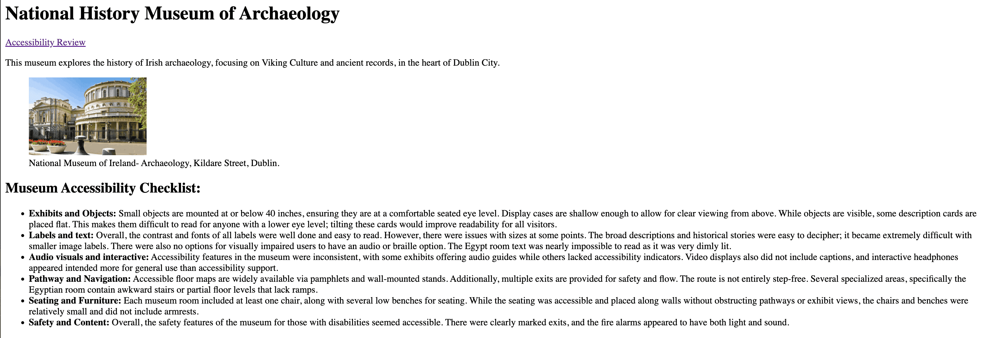
My turn came at the National History Museum of Ireland, where I worked with Tasnimah Uddin and Olivia Lombardo to audit the space using a checklist adapted from the Smithsonian Guidelines for Accessible Exhibition Design — covering audio/visual features, seating, exhibits, pathways, labels, and safety. Out of the items we rated, the museum met just 57% outright (26 met, 15 partial, 5 not met, 5 not applicable).
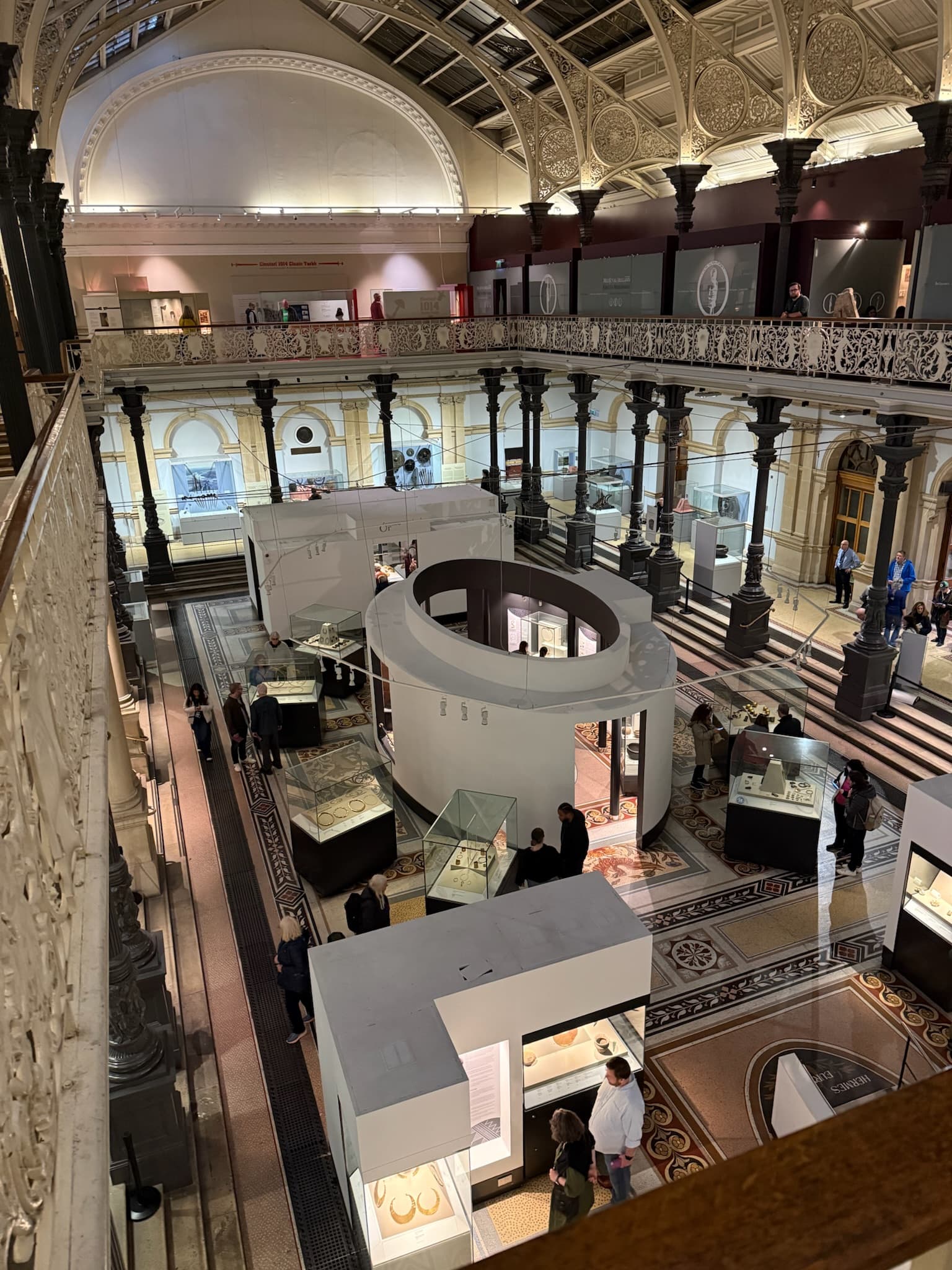
- Reading position mattered more than we expected: description cards laid flat in display cases were far harder to read for anyone at a lower eye level (for example, a wheelchair user) than cards tilted forward — an incredibly small and cheap fix (some cases in the museum already did this correctly) that was simply applied inconsistently.
- Navigation was difficult, especially when rooms got smaller: main galleries comfortably met the recommended clearance width, but smaller specialized rooms narrowed sharply, with tight turns that would leave a wheelchair user with no room to reroute at a dead end. Most of this issue was on the second floor — which had no elevator, rendering the entire floor inaccessible to individuals with mobility impairments.
- Alternative formats were nearly absent: no braille or large-print signage existed anywhere except a single unrelated activity sign, and the audio guide only covered artifacts that already lacked written labels — meaning it functioned as a patch for a different problem, not as an accessible alternative to reading. Worse, selecting the correct audio guide number required reading a number printed behind glass, which defeated the purpose for the visually impaired visitors who needed the audio option most.
- Lighting created a significant barrier: the Egyptian room was dim enough (for artifact preservation) that even visitors with typical vision struggled to read labels; this room also had extremely uneven flooring, compounding the risk for anyone who couldn’t see it clearly. Many other rooms were similarly dim, without adequate lighting for visitors with low vision.
Design process: Building to WCAG 2.2
For my individual final project, I built a multi-page travel blog documenting my three weeks in Ireland — daily highlights, my favorite food, and an overview of the trip itself. The project let me put a full range of front-end skills to use: semantic HTML5 structure, CSS Grid and Flexbox for multi-column layouts and image galleries, responsive design (including breakpoints and OS-level preferences like prefers-reduced-motion and prefers-color-scheme), and light JavaScript interactivity like image lightboxes. This was my first real experience in web development, and it was fascinating to apply what I was learning in class directly to documenting my own trip.
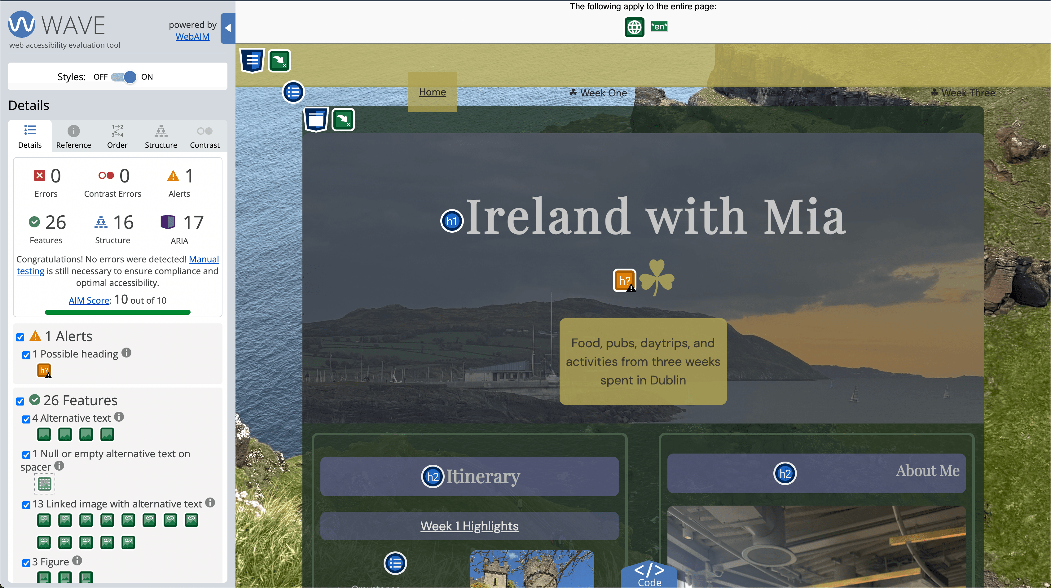
The constraint that shaped every design decision was WCAG 2.2 compliance, built in from the first line of code — not as a final check. I used WAVE and Axe DevTools throughout development to catch what I couldn’t always see myself. Building for accessibility from the start ensures a site isn’t gated by an ignorant design choice, and that everyone can actually enjoy the content, not just access it. A few of the specific guidelines I built around:
Contrast (Minimum)
Text needed at least a 4.5:1 contrast ratio against its background — the same principle the museum mostly got right on labels, but missed inside display cases with glare and shadowing.
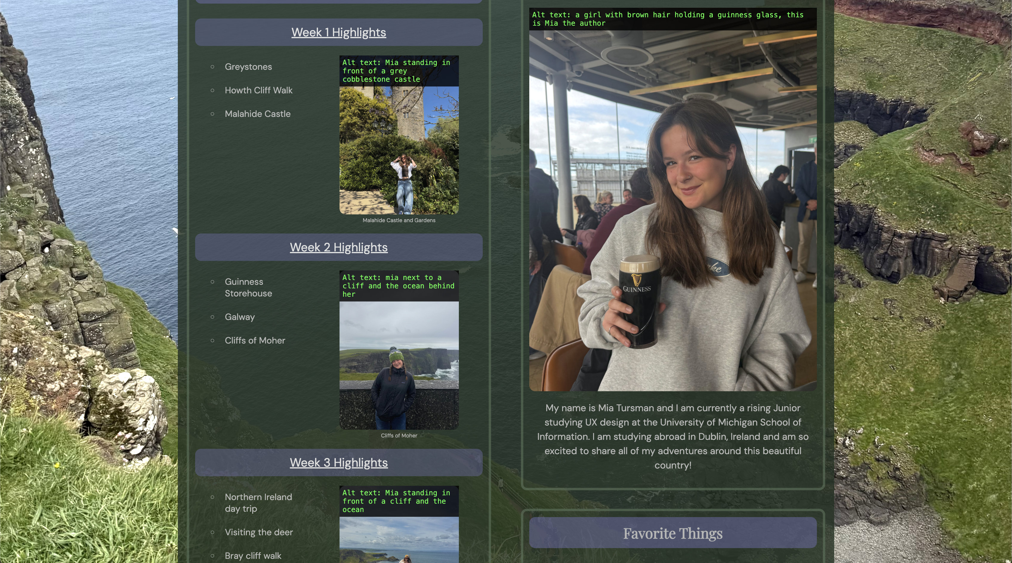
Non-text Content
Every image needed meaningful alt text.
Keyboard
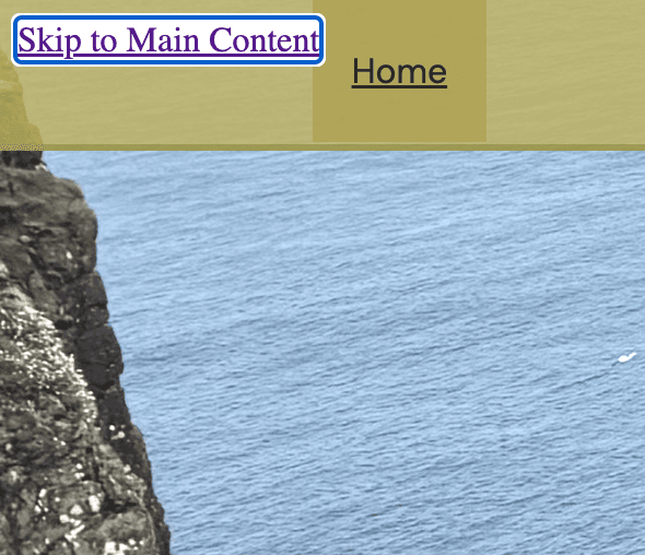
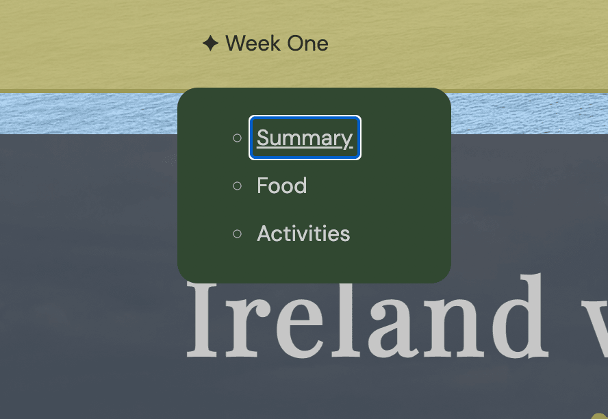
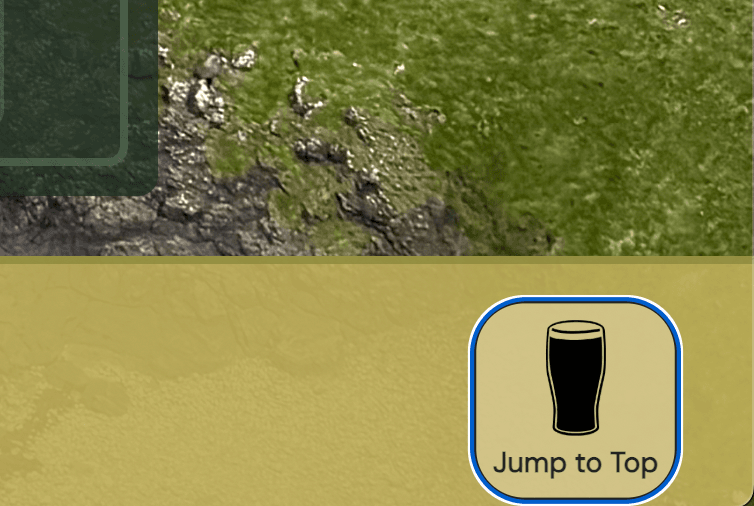
Every interactive element (including JavaScript lightboxes) had to be fully operable without a mouse.
prefers-reduced-motion
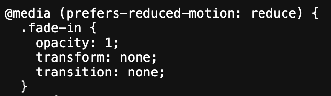
Respecting a user's OS-level motion preference, rather than assuming everyone tolerates animation equally.
What connects them
Auditing a 19th-century museum building and coding a website feel like unrelated tasks until you notice they’re graded on the same rubric. A flat description card and a missing alt attribute are the same failure: someone assumed that everyone experiences content the same way. Walking the museum with a checklist in hand let me see WCAG’s more abstract guidelines — “ensure sufficient contrast,” “support keyboard navigation” — as directly connected to real physical barriers, not just digital ones. By examining physical UX failures firsthand, I could finally contextualize what digital accessibility design is actually protecting against.
What I learned
Before this course, I had never considered the importance of digital accessibility. I understood the basics of physical accessible design — ramps, elevators, braille — but I’d never noticed the connection between those and their digital equivalents: contrast errors, flashing content, missing alternative text. Three weeks of moving between real spaces and real code taught me how much exclusion these failures — and many others like them — actually cause.
Auditing the National History Museum was an eye-opening experience. Watching how a flat description card, a dim room, or a missing ramp quietly excluded someone — not through malice, just through a design choice nobody questioned — made every WCAG guideline I’d previously seen as an abstract rule suddenly feel obvious and necessary. I couldn’t read “ensure sufficient color contrast” the same way again after seeing what happened when a museum didn’t.
Touring Google’s Dublin Accessibility Discovery Center added another layer to that experience. Where the museum showed me what happens when accessibility is treated as an afterthought, Google’s lab demonstrated the opposite end of the spectrum — teams actively designing for enjoyment, not just function, for people with disabilities. The Irish Wheelchair Society showed me that same commitment outside of a tech company entirely: they ran a wheelchair sport league, offered driving lessons in accessible cars, and held group sessions helping individuals adapt to life with a disability. Seeing both models — one in a corporate innovation lab, one in a community organization — in the same three weeks made the gap between “afterthought” and “genuine commitment” impossible to ignore.
That shift followed me directly into my own code. Building my travel blog, I started testing decisions against a new question:
Not “does this technically comply,” but “who does this leave out if I get it wrong?”
That’s a different design instinct than the one I walked into this course with, and it’s one I don’t think I could have developed from a textbook alone. It took seeing exclusion happen in a real room before I understood what I was actually building toward every time I wrote an alt tag or tested a page with a keyboard.
This experience was especially meaningful to me as a student studying user-experience design. It reinforced that people do not all interact with spaces, information, and technology the same way — and that accessibility can’t be treated as an afterthought. It’s an essential part of creating thoughtful, inclusive experiences.
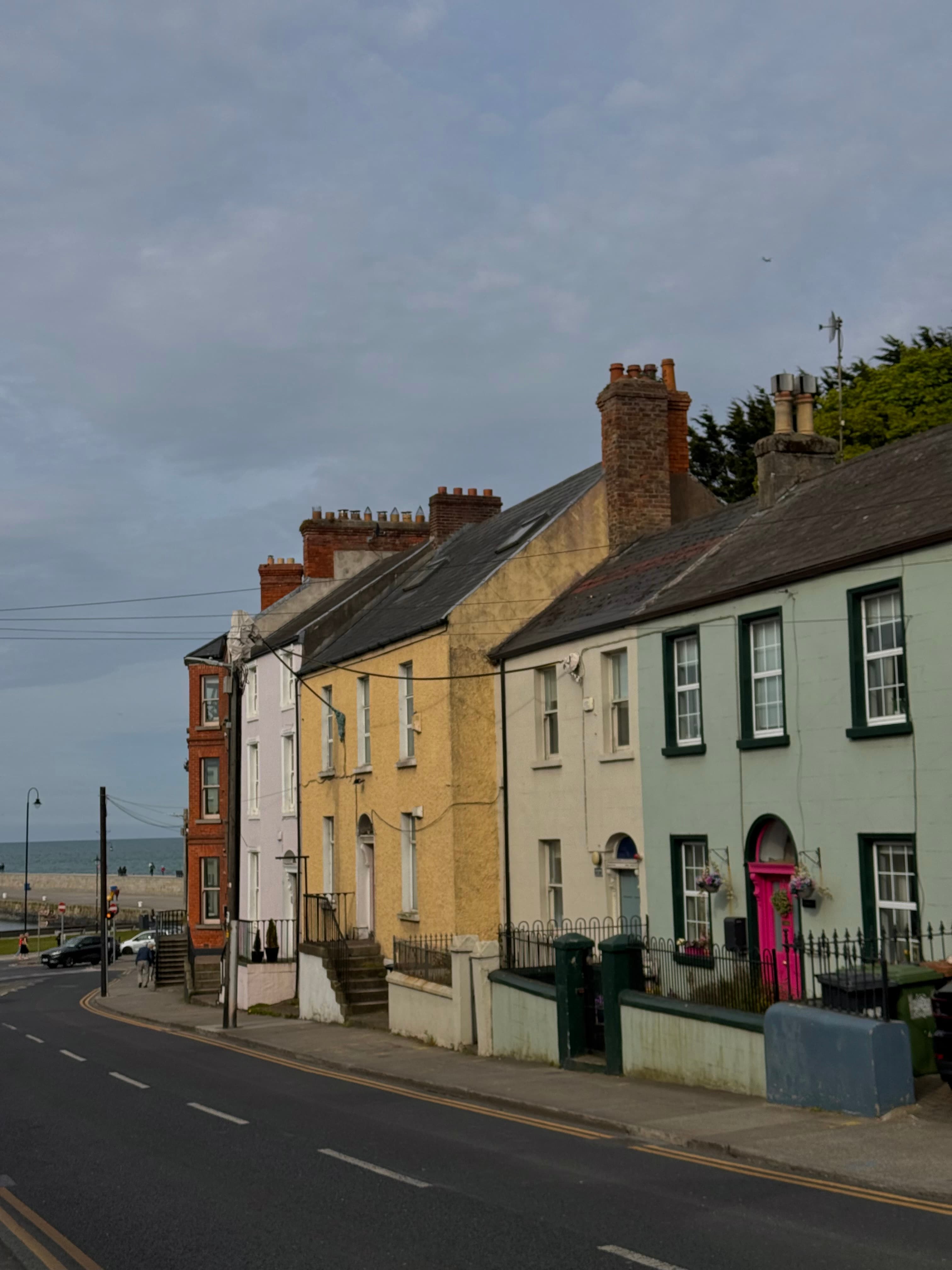
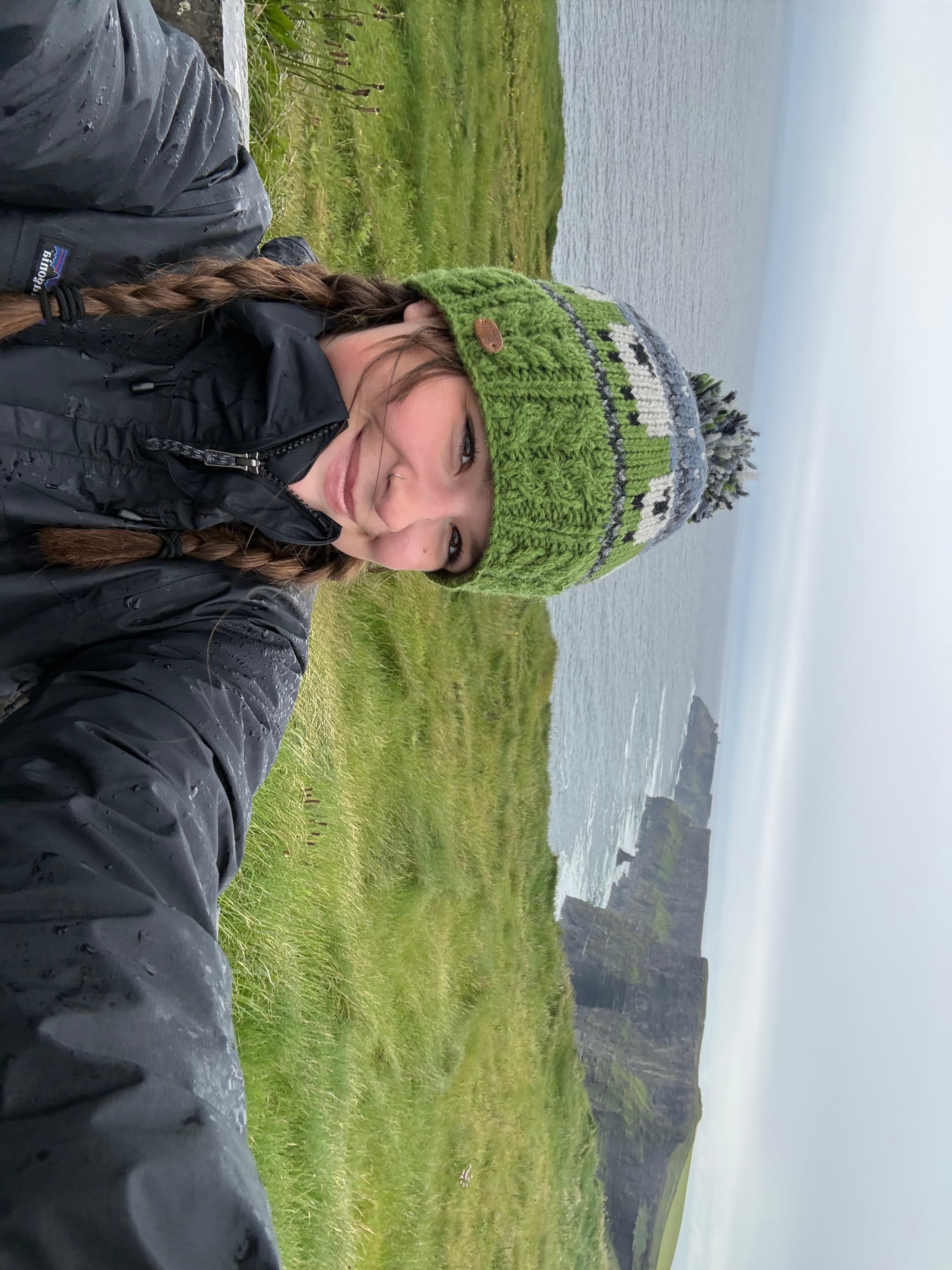
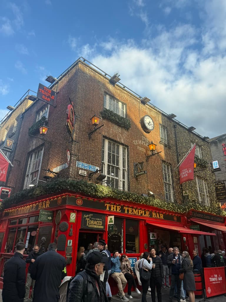
A few moments from three weeks in Dublin.