Designing a photo-contribution app for Lasso Loop
A semester-long product design project: from PRD to a 15-frame mobile flow in Figma
- Course
- SI 307, University of Michigan School of Information
- Client
- Lasso Loop
- Timeline
- Fall 2026 (in progress)
- Role
- Solo UX Design Student
- Tools
- Figma (Figma Design, Figma Make, Auto Layout, components)
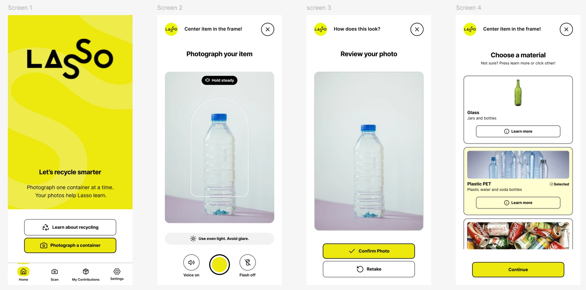
For a UMSI design course, I’m designing a mobile app flow for Lasso Loop’s home recycling appliance, aimed at people who want to recycle correctly but can’t tell whether a container is recyclable. So far I’ve built a 15-screen prototype in which users photograph a container, choose its material with reference photos and optional “Learn more” explanations, and get quick feedback as they contribute photos that help improve Lasso’s AI.
This is a work in progress; the flow is built in Figma with Auto Layout and reusable components and designed with accessibility in mind, but it hasn’t been tested with users yet, and I plan to refine it based on feedback.
Overview
SI 307 is a semester-long project where each student works from a real client brief. Lasso Loop offered two options: the Lasso Cube (a public smartbin) and the Lasso Basic App (a mobile app for material-ID photo contributions). I chose the app brief. Its core task, helping everyday people learn to recycle correctly, connects to my Environmental Studies minor, and designing for people with little recycling background is the kind of UX problem I wanted to work on.
I worked through it in stages, starting with a product requirements document (PRD) and ending with a high-fidelity, 15-frame flow built in Figma.
Users and personas
I defined two personas to anchor the design. They come from the client brief and my PRD’s assumptions about who would buy a home recycling appliance: environmentally conscious homeowners who care about recycling but find the system confusing. I haven’t validated them with real users yet.
Jennifer
50, San Diego. Owns home appliances and is the core user the app is built around.
Wants: To do the right thing, with clear and simple steps. She worries about guessing wrong.
Shaped: Plain-language material cards and optional “Learn more” explanations that teach without blocking the flow.
Rob
52, a Sacramento suburb. An appliance owner who is reluctant and skeptical.
Wants: An app that feels quick and worthwhile. He is wary of effort that doesn’t pay off.
Shaped: A short one-photo flow, a “Not sure? That’s okay.” line on the material screen, and a thank-you screen that shows his contribution count right away.
Designing for Rob pushed me to keep the flow simple and low-pressure, while Jennifer kept me focused on teaching without getting in the way.
Design process
PRD and early concepts
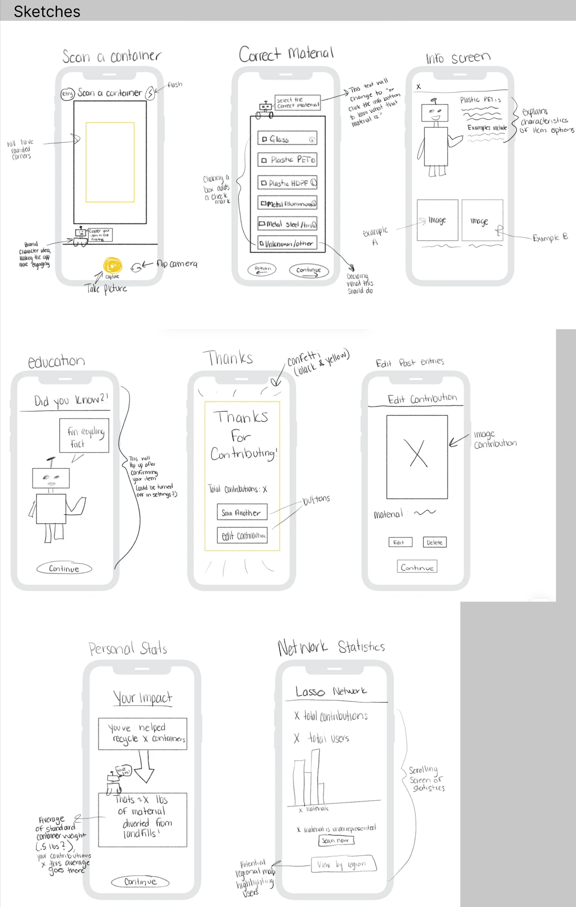
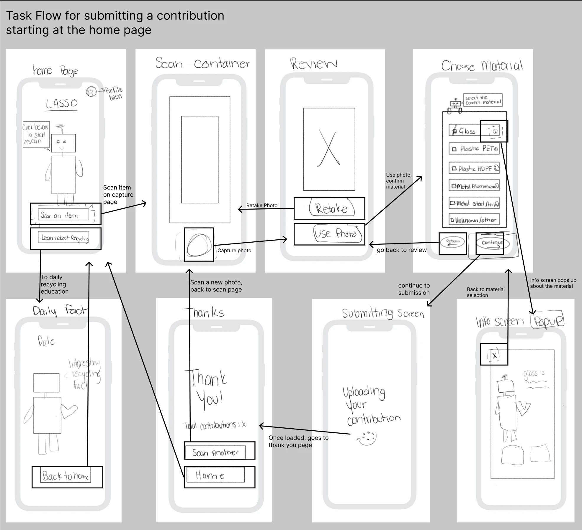
The PRD defined the user problem (who, what, where, when, and why) and the two personas, and it scoped the work around the brief’s single feature: contributing a photo and labeling its material. My early wireframes explored three different ways to capture a container: a guided single photo with voice and haptic help, a “pile mode” for photographing several containers in one sitting and reviewing them one at a time, and a material-first flow where users choose the material before the camera opens.
Brand and voice
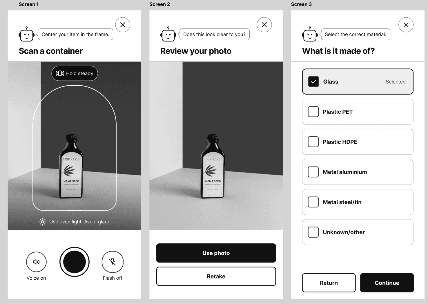
In the PRD stage, the app featured a friendly robot mascot named “Lasso” (“Hey, I’m Lasso!”) in onboarding and feedback screens. In the current flow, I replaced the mascot with the client’s own Lasso logo in the header so the design stayed faithful to the brand. I wasn’t happy with how the generated robot looked, and using the client’s logo avoided inventing a character the client never asked for. The short, friendly speech-bubble messages stayed, so the voice carried over.
Narrowing to one flow
For Assignment 4, I took one wireframe idea and built it into a 15-frame colored flow using Figma Design, Auto Layout, and 5+ reusable components. The flow as it stands has the user photograph the item, then self-identify the material.
I dropped an earlier barcode-scan idea because it added a step before the photo and label, which are the contribution Lasso actually needs. It would have slowed down a user like Rob, many containers have no usable barcode, and it relied on a product database the brief never mentions.
Designing for things going wrong
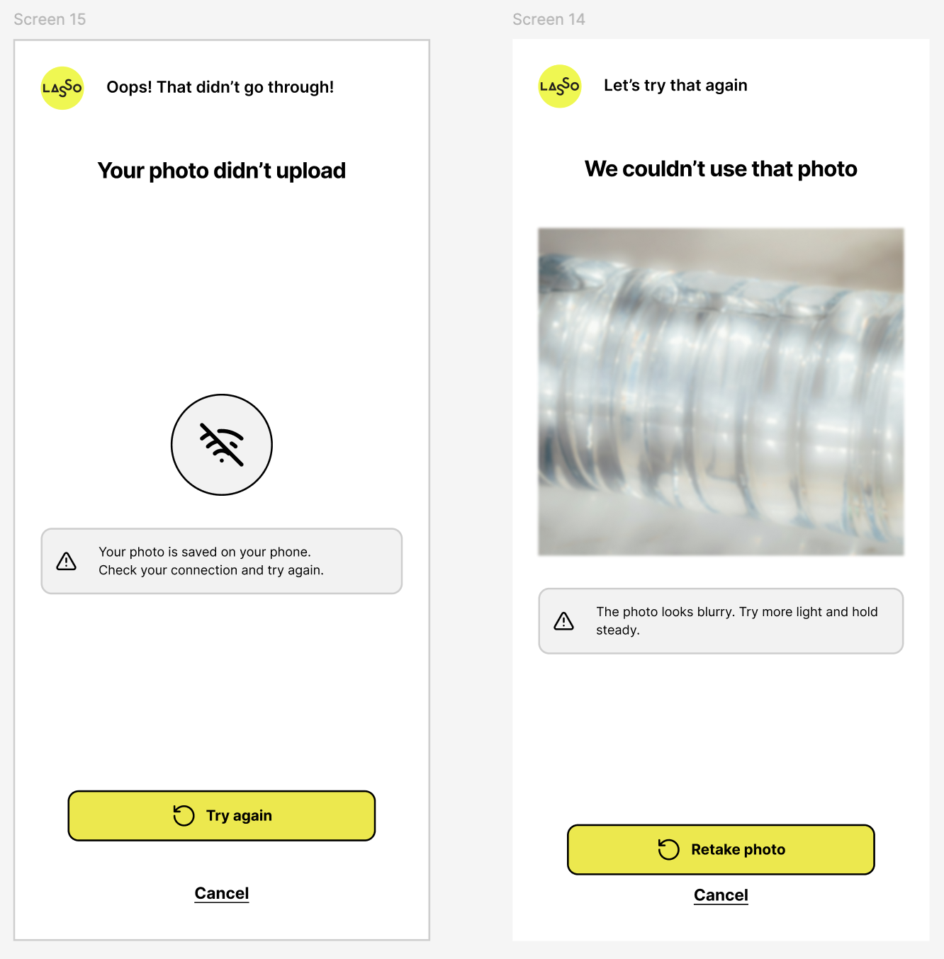
I designed two non-happy states rather than just the ideal path: photo not accepted and upload failed.
- Photo not accepted: The screen shows the blurry photo with a banner that says what happened and what to try (“The photo looks blurry. Try more light and hold steady.”), with a clear “Retake photo” button.
- Upload failed:The screen says the photo is saved on the phone and to check the connection, with a “Try again” button.
Both use an icon and words, not color alone, and neither blames the user.
Build process
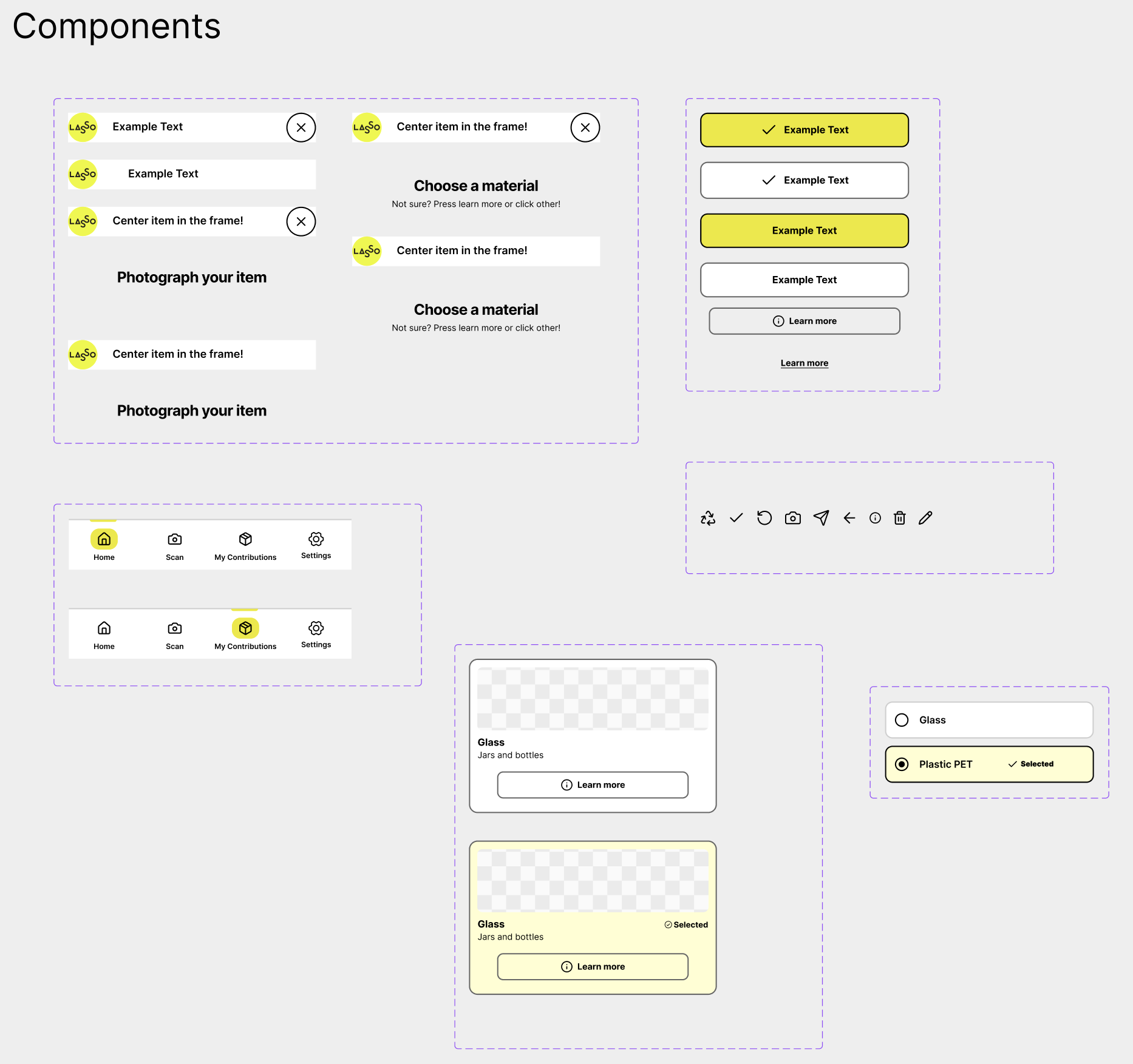
I first built the 15 frames in Figma Make, then rebuilt them in Figma Design so the file used proper Auto Layout and components instead of generated output. The generated frames came in with nested fixed-width layouts, icons that showed up as text, and layers that didn’t stretch. I learned to build the shared components first, set widths to Fill container from the outside in, and test by dragging a frame wider and narrower.
Where the design is now
This is the first walkthrough for 15 stages of the flow, not a finished solution. It shows the direction I’ve chosen and the decisions I’m still testing for future iterations.
A user opens the app on a home screen that explains in one line what it does and offers one clear action, “Photograph a container,” with “Learn about recycling” as a quieter option. The camera screen shows a framing guide, short written tips, and voice and flash controls beside the shutter. After the photo, the user reviews it and either uses it or retakes it.
Next, they choose the material from a list of cards, each with a reference photo, a plain name, and a one-line description. “Learn more” opens a short explanation with example photos, and “Unknown/other” is a normal choice. The user confirms the material and gets immediate feedback on recyclability, then sends the contribution.
A thank-you screen shows how many containers they have shared and a “Did you know?” fact. My Contributions lets them review past photos, edit a material, or delete a contribution, and deleting asks for confirmation with “Keep photo” as the main button. I expect parts of this to change once I can put it in front of users.
You can explore the full Figma file below. Drag to pan, and scroll or pinch to zoom.
What I’ve learned so far
Designing for the persona Rob has led most of my decisions so far. A skeptical user judges an app by how much it asks of them, so I cut out the barcode step I originally considered, kept the flow to one photo, and made “Unknown/other” a possible answer for users unsure of what to choose. I’ve also learned to design error states to be part of the experience: someone who hits a failed upload decides whether to trust the app, so what that screen says matters as much as the happy path.
Rebuilding the generated frames by hand showed me the gap between output that looks finished and a file that actually works. The initial frames generated with Figma Make fell apart when I resized them, so I built the shared components first (button, header, navigation bar, material card, and contribution row) and converted every item to the correct Auto Layout format by hand. It is clear that AI tools cannot recreate the same formats and styles that humans can, so I have learned it is necessary that I understand how to use Figma tools and design principles.
Open questions and next steps
This design hasn’t been tested with users, so the biggest open question is whether choosing a material from photos and short descriptions actually helps people decide correctly. Other questions I’m still working through: whether the voice guidance (shown as a control, not built) is worth building for accessibility standards, whether the “Did you know?” and recyclability messages teach anything or just add steps, and whether there is any friction throughout the flow.
Next, I plan to iterate new designs in Figma until I reach a final fully designed flow for the app. Currently, there are only 15 screens; by the end of the semester I will have every possible screen for the application designed. The final step is to create a slide deck walking through my design process and presenting the final files to the stakeholder, Lasso Loop.